— hospitality / coffee / retail
The Common Cafe
A full brand identity system for a small-batch artisan bakery — built to feel nostalgic, handcrafted, and deeply human. From logo to packaging to social media, every touchpoint tells the same story.
Food & Beverage
Brand Identity
SEO & Local Search • Content Strategy, Copywriting, E-Commerce • Print & Collateral • Brand Identity • Web Design & Development • Meta & Google Ads • Social Media Management • Email Marketing •
Industries served
12+
E-comm, beauty, food, trades & more

Client
Wild Flour Bakery Co.
Industry
Food
Tags
Brand Identity | Marketing | Social Media |
Wild Flour Bakery is a small-batch artisan bakery specializing in handcrafted sourdough and rustic pastries. For this project, the goal was to create a warm, tactile brand identity that felt nostalgic yet fresh — rooted in the tradition of slow, mindful baking. We developed a full visual system including a hand-drawn logo, secondary mark, and packaging graphics inspired by vintage recipe cards, botanical flourishes, and earthy textures. The brand’s personality leans into a sense of homegrown charm with a touch of quiet elegance.
The visual identity features a soft, neutral palette — cream, warm brown, herb green, and wheat gold — paired with serif and sans-serif typography for a balanced, rustic-modern tone. We designed seamless illustrations of bakery elements like bread, wheat stalks, and whisks, which were used across packaging, patterns, and brand collateral. A fully illustrated, single-page menu was created alongside custom stickers, stamps, and signage, all aligned with the hand-drawn look. Social media templates carried the identity across digital channels with launch countdowns, product features, and ingredient spotlights.
The final delivery included a full logo suite, print-ready menu and label designs, a digital launch kit, and a brand guide outlining color usage, type, and illustration treatments. Wild Flour launched with a cohesive, personality-rich identity that could be adapted across both physical and digital touchpoints. The result is a bakery brand that feels not only crafted—but deeply cared for, just like the bread it sells.
— Client
The Common Cafe
Studio Concept Project
— industry
Hospitality / Coffee / Retail
— services
-
Brand Strategy
-
Logo System
-
Visual Identity
-
Illustration System
-
Packaging
-
Menu Design
-
Environmental Branding
-
Social Media Direction
-
Merch Concept
— the challenge
A coffee brand that couldn’t belong anywhere else.
Many café brands rely on the same visual language: minimal logos, neutral interiors, generic coffee cup icons, and lifestyle photography that could belong to almost any neighbourhood. For a café on Ossington — one of Toronto’s most recognizable cultural strips — the brand needed to feel more specific.
The challenge was to create a café identity that felt local without becoming cliché. It needed to reference Toronto and Canadian culture without leaning on obvious symbols alone. The brand also needed to feel cool and design-forward, but not cold, corporate, or overly polished.
The question became: how can a café feel like it truly belongs to its neighbourhood?
"How can a café feel like it truly belongs to its neighbourhood?"
The answer was to build the identity around the idea of shared public space — a place where people gather, pause, work, meet, and feel part of something familiar.

Logo system — primary lockup, secondary mark, and wordmark.
— the approach
Built from the
inside out.
Before developing the visuals, the brand was positioned around the idea of “the common” as both a physical and emotional space. A common is a shared place — somewhere public, useful, and open to everyone. For a café, this idea naturally connects to the concept of the “third place”: not home, not work, but somewhere in between.
The strategic direction was to make the café feel like Ossington’s neighbourhood notice board. Instead of treating the brand like a typical coffee shop, the identity borrows from public service announcements, community bulletins, local posters, transit language, civic signage, and street-level Toronto culture.
The result is a brand that feels approachable but distinct. It uses bold typography, stamp-like graphics, poster textures, and local messaging to create a visual world that feels rooted in community.
Core brand lines include:
-
Coffee for the common good.
-
Ossington’s common ground.
-
A place for our neighbourhood to gather.
-
Good coffee. Strong neighbourhood. Better together.
-
Posted for public good.

— illustration system
A little Toronto world,
drawn in brand language.
The illustration system expands the brand beyond typography and gives it a stronger visual personality. It draws from the street-level culture of Ossington and Toronto: posters, transit, storefronts, bulletin boards, street poles, coffee grounds, and shared tables.
Key illustrations include:
-
Bulletin kiosk / notice board icon
-
Street pole poster stack
-
Toronto streetcar graphic
-
Community bulletin board
-
Ossington street scene
-
Coffee grounds and roots illustration
-
Shared table symbol
-
Local stamp graphics
These illustrations help the identity feel less dry and more ownable. They also create a flexible system for posters, packaging, social media, merch, and in-store graphics.

.png)

— packaging and print
The brand you can
hold in your hands.
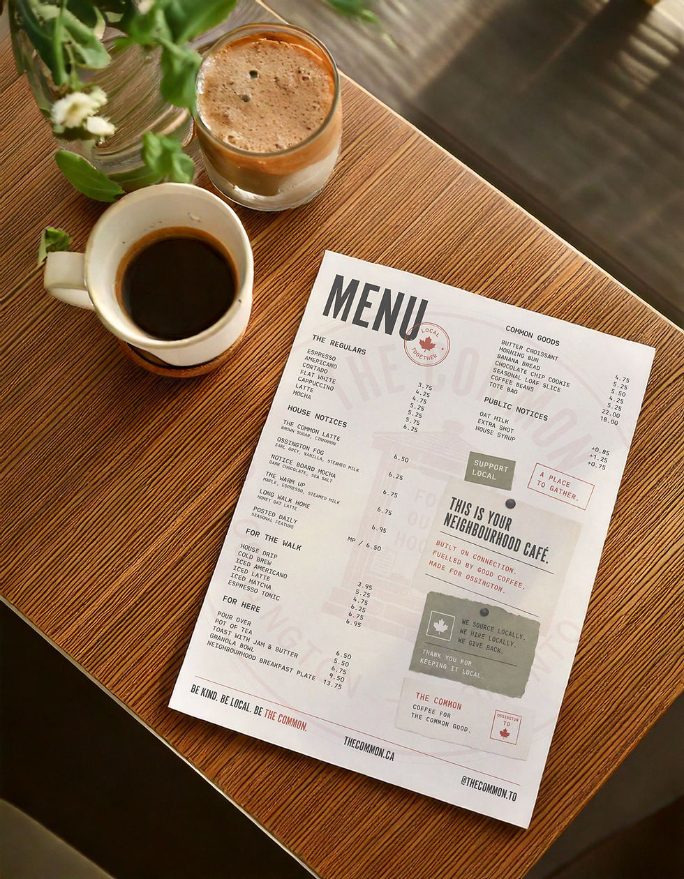
The packaging system was designed to feel tactile, local, and collectible. Rather than using plain café packaging, each item feels like a small public notice or neighbourhood object.
Packaging concepts include:
-
Red takeaway coffee cups
-
Menu design
-
Coffee bean bags
-
Pastry bags
-
Cup sleeves
-
Stickers and seals
-
Loyalty cards
-
Takeout boxes
-
Napkins
-
Retail labels
The coffee bags explore neighbourhood-inspired blends such as Ossington Blend, Common Ground Espresso, and For Our Hood Community Roast. Each bag uses the brand’s public notice language, location badges, tasting notes, stamp marks, and editorial layout system.
The red takeaway cups create a strong brand moment on the street. They act as walking posters for the café, using the signature red as a bold, recognizable brand colour.


— Social media
Built to live
on every screen.
The social media system extends the PSA/bulletin-board concept into digital content. Instead of generic café posts, the brand can communicate through “notices,” “daily bulletins,” and “community updates.”
Social content examples include:
-
Daily drink features
-
Seasonal menu announcements
-
Community bulletin posts
-
Event notices
-
Poster-style quote graphics
-
Neighbourhood photography
-
Product and merch drops
-
Behind-the-scenes roasting or baking content
Example post language:
PUBLIC NOTICE: The Warm Up is back.
TODAY’S BULLETIN: Croissants are still warm.
NEXT STOP: The Common.
COMMON GOODS: Beans, bags, and better mornings.
This gives the brand a strong content system that is easy to repeat without becoming boring.

Full Deliverables
✓ Primary logo + secondary mark + icon
✓ Typography system & usage guide
✓ Brand pattern & texture system
✓ Print-ready menu design
✓ 6 social media templates
✓ Primary logo + secondary mark + icon
✓ Typography system & usage guide
✓ Brand pattern & texture system
✓ Print-ready menu design
✓ 6 social media templates
— the result
A brand that feels
clear role in the neighbourhood.
The final identity gives The Common a complete and ownable brand world. It is not just a coffee shop with a logo — it is a neighbourhood café with a clear point of view.
The system allows the brand to show up consistently across physical space, packaging, posters, social media, merch, and customer experience. Every touchpoint reinforces the same idea: The Common is a place for people to gather, connect, and feel part of the neighbourhood.
The result is a café concept that feels local, memorable, and flexible enough to grow. It can operate as a daily coffee shop, a community hub, a retail brand, and a cultural spot on Ossington.
"The Common becomes more than a cafe. It becomes Ossington's common ground."